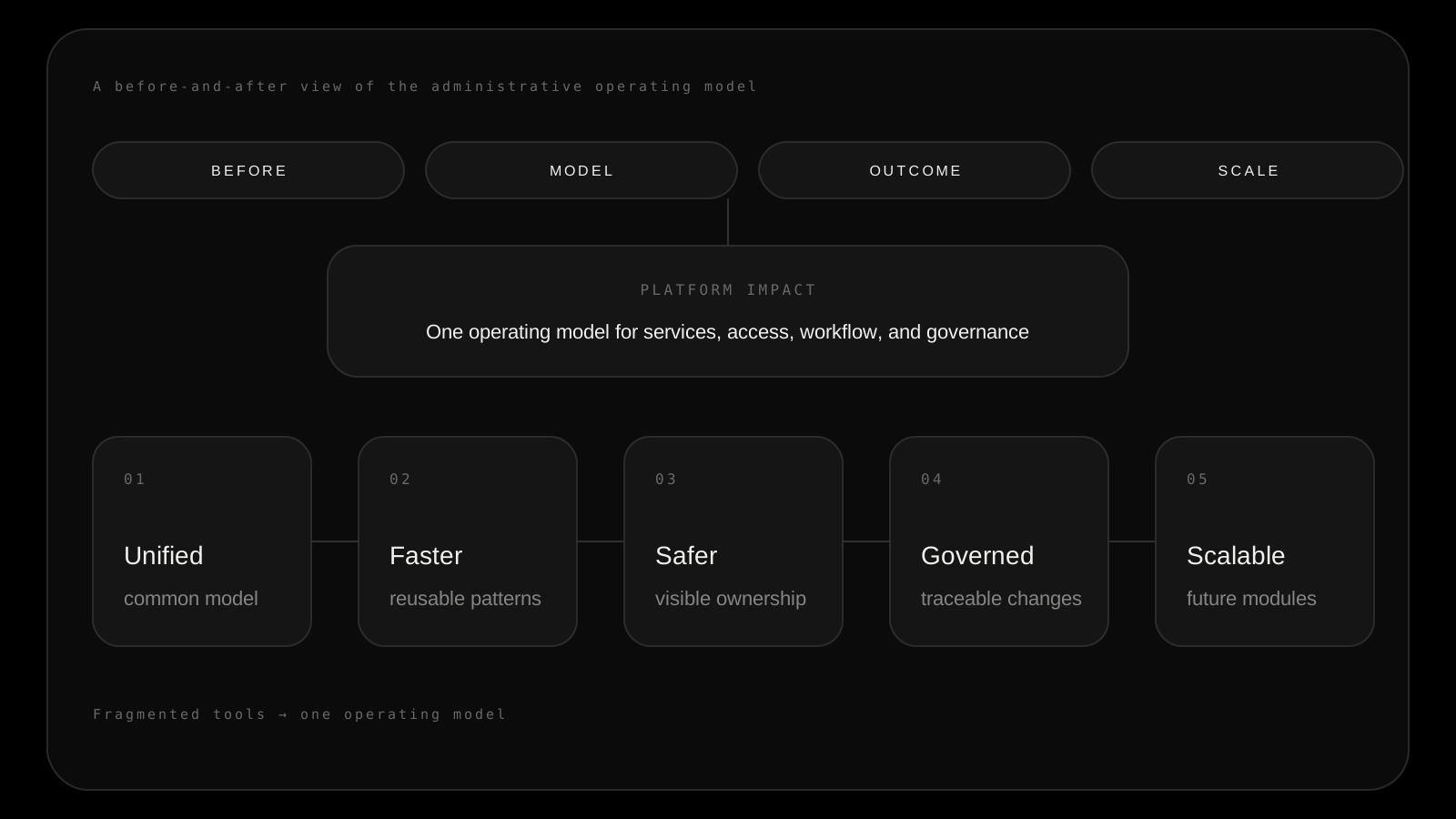
Designing the work behind the interface
Designing the administrative layer behind a complex industrial platform: people, services, access, change, and governance.
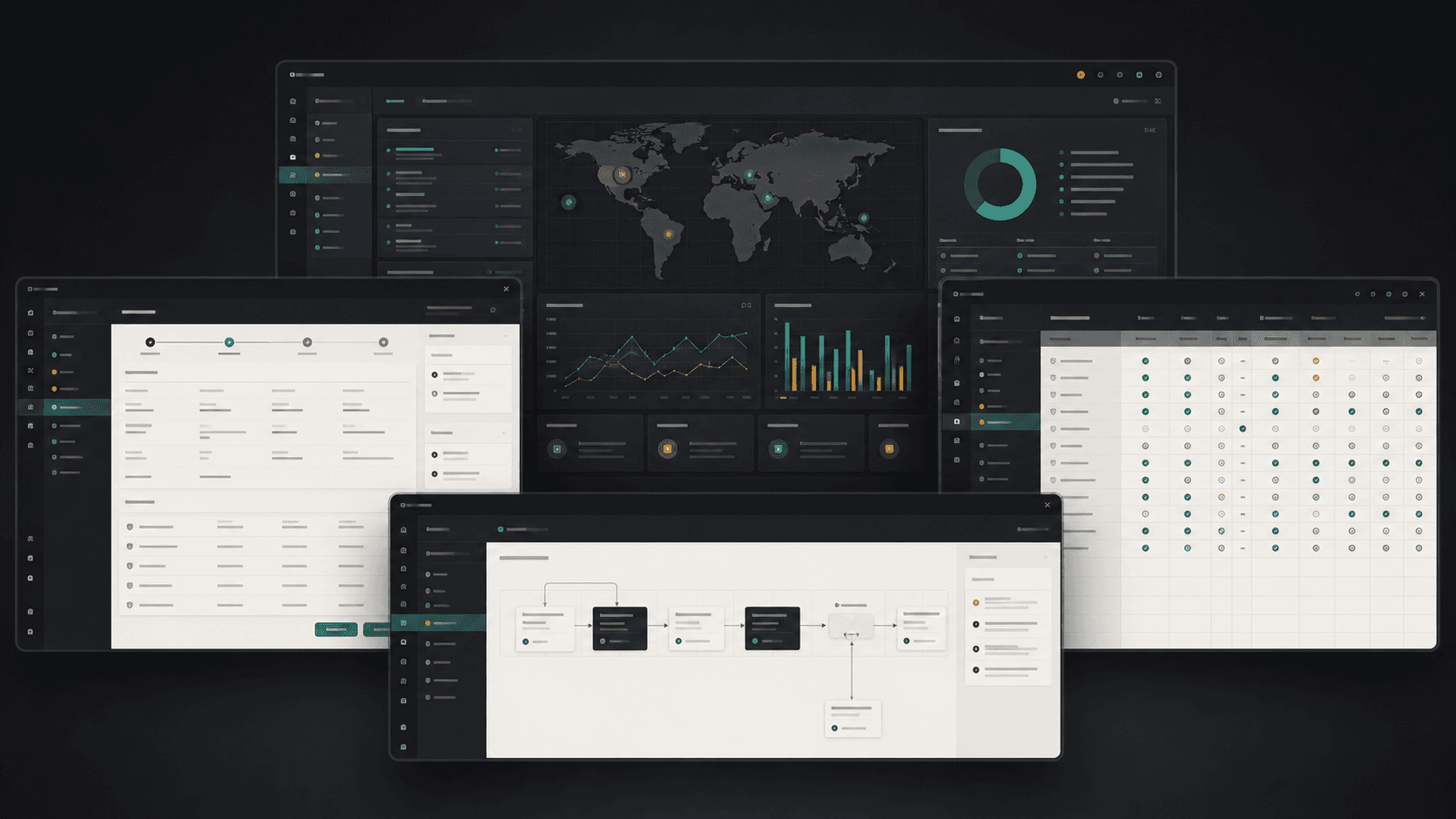
The platform reflected system architecture, not the administrator’s mental model.
I reframed administration as a shared operating model for responsibility and change.
A coherent foundation for people, services, access, workflows, and auditability.
The system was designed as a set of connected operating surfaces.
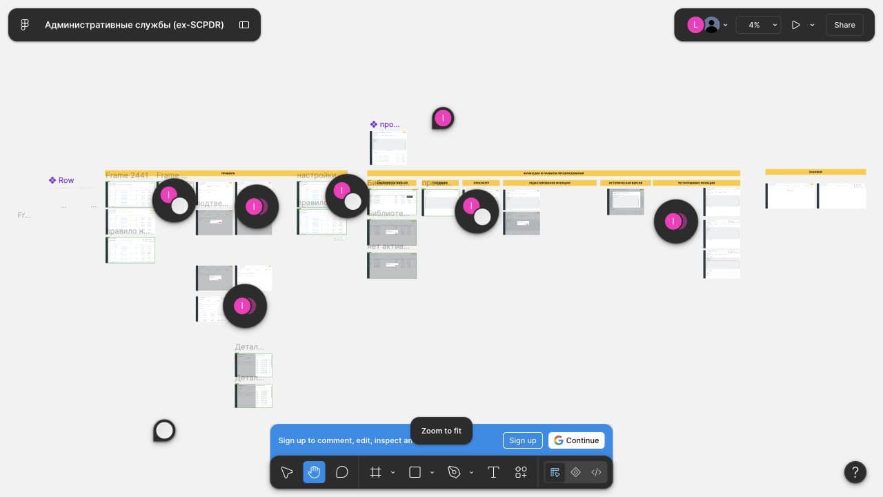
- Multiple administrative domains were being designed as one connected experience.
- Lists, details, configuration, and state had to work together across the same object lifecycle.
- The visual system was part of the architecture, not a final layer added after the workflows.
Source: Figma working file · administrative services / ex-SCPDR
The screens were only one part of the problem.
Administrative work crossed organizational roles, services, permissions, and operational rules. The first design task was not styling the screens. It was finding the relationships that made the system understandable.
What I mapped
- Who owns a service, object, or change
- What each role can see, edit, or approve
- Which dependencies become risky when changed
- Where an exception needs a human decision
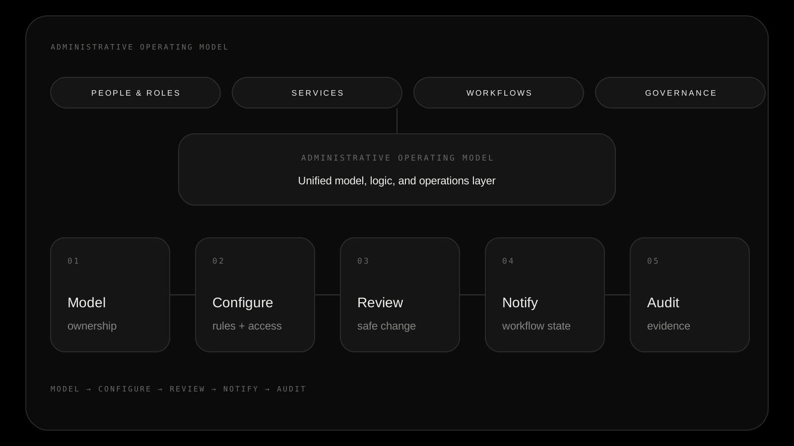
Users should not have to learn the platform before they can manage it.
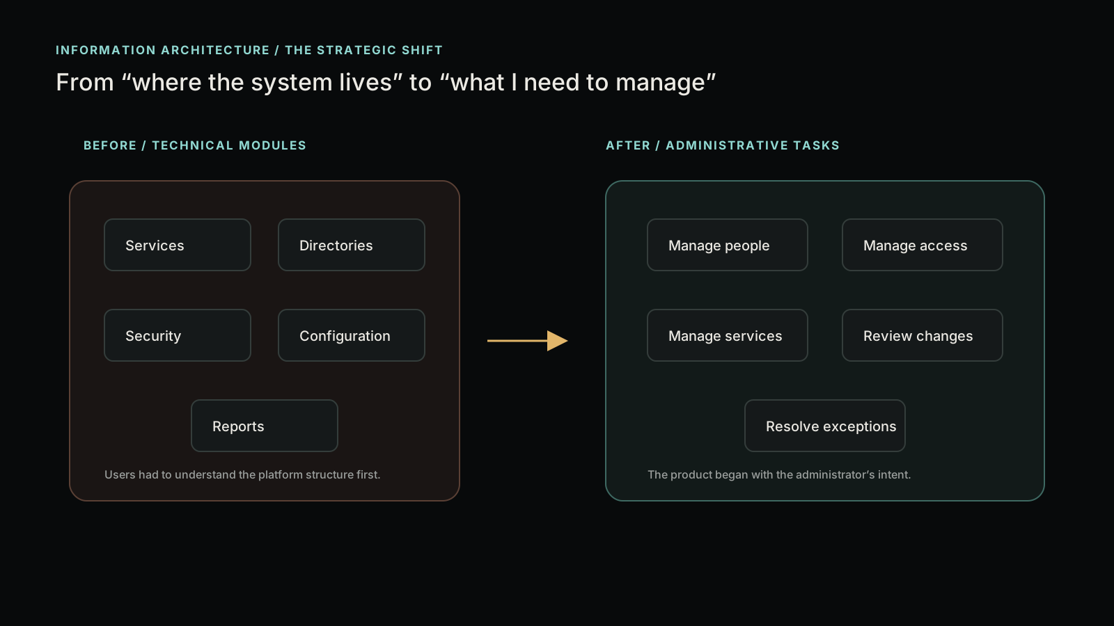
The shift was from technical modules to administrative intent. Instead of asking users to locate the right subsystem, the product started with the responsibility they were trying to complete.
That decision gave new services the same vocabulary and kept the interface consistent beyond this set of screens.
The senior design work was in the trade-offs.
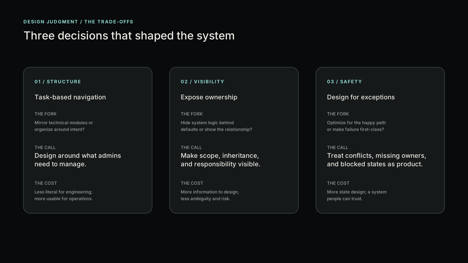
Task-based navigation
I chose an information architecture organized around what administrators need to manage, accepting that it would be less literal for engineering teams.
Expose ownership
I made scope, inheritance, and responsibility visible because hidden logic creates unsafe decisions in enterprise tools.
Design for exceptions
Conflicts, missing owners, and blocked states became product states instead of last-minute error messages.
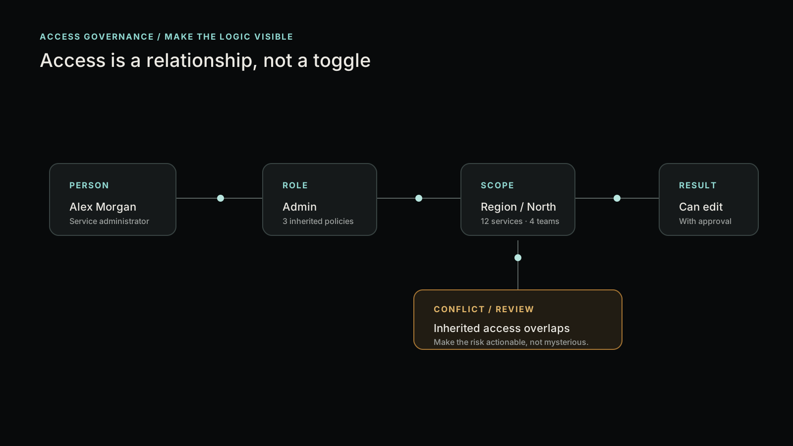
Access is a relationship, not a toggle.
Permission design became a way to explain the organization itself: who acts, where they act, what they inherit, and when a decision needs review.
Where the role applies
What comes from above
What needs attention
What the user can do
High-impact changes became reviewable and traceable.
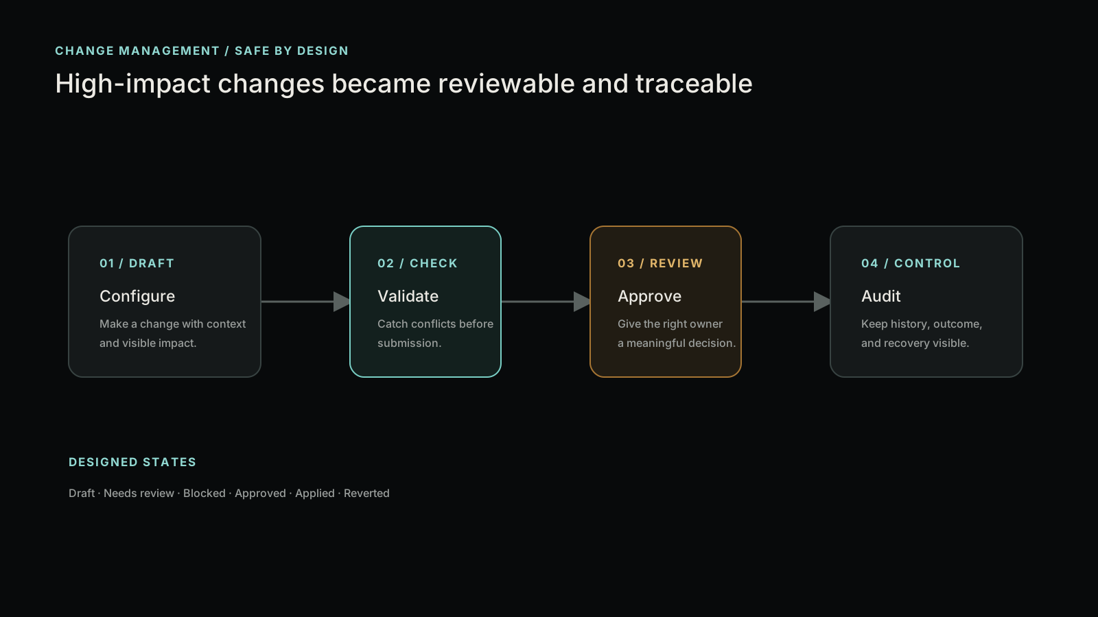
Draft
Configure with context
Check
Validate before submission
Review
Give the right owner a decision
Audit
Keep outcome and recovery visible
The “Mail” module was a cross-product communication layer.
The project discussion surfaced a more consequential part of the work: designing the notification framework that carried business events across assignment, approval, validation, deadline, and escalation workflows.
The work was bigger than writing email copy. It defined a reusable communication layer for the platform.
Read the project discussion →Business event
Assignment, approval, deadline
Notification service
Selects the message path
Template selection
Maps state to content
Role-aware content
Answers what matters now
Delivery
Email, inbox, escalation
new · finished · accepted
approaching · expired
declined · info · urgent
Every notification had to answer five operational questions.
Why did I receive this?
What happened?
What do I need to do?
How urgent is it?
Where do I click?
The standardization pattern
A consistent structure let each event remain specific without making every notification feel like a new product.
Accurate was not the same as actionable.
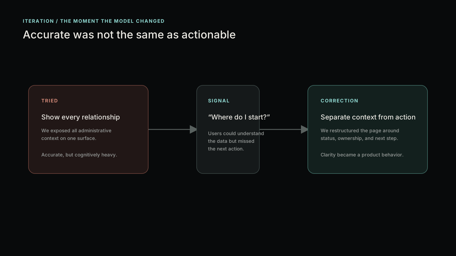
Our first version exposed too much administrative context on one surface. It was accurate, but users hesitated because the next action was not obvious.
The correction separated status, ownership, and action into distinct layers. The system became easier to trust because the interface made the decision path legible.
Consistency became a governance mechanism.
The shared patterns were not a decorative library. They gave every administrative object the same vocabulary for status, ownership, warnings, actions, and history.
That made the product easier to extend without reopening the core interaction model every time a new service appeared.
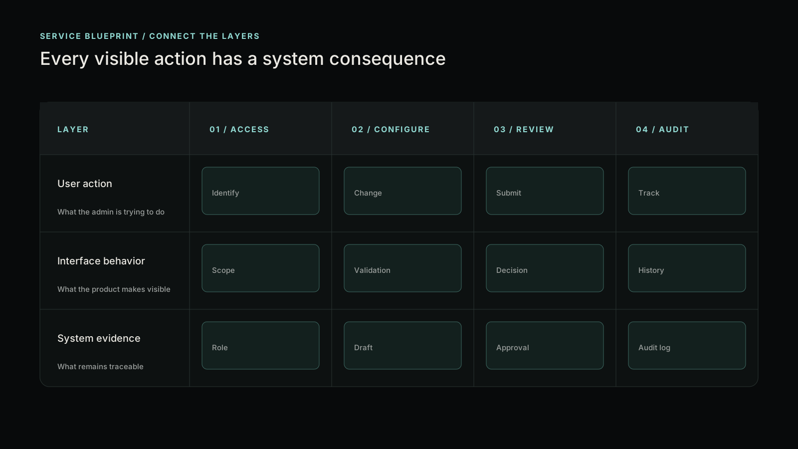
A clearer administrative foundation for the platform.